
SPI Cinemas Mobile App Redesign
I have been an avid user of the movie booking application by SPI Cinemas, ever since I set my eyes on it. But as soon as I started using it, I became aware of a number of UX design issues, and I decided to redesign the app as a personal project by addressing the most frequent user issues and modernising the UI as a whole.
Tools Used
Adobe XD, Adobe Photoshop, Adobe Illustrator
Research and Analysis
SPI Cinemas is one of the most renowned movie theatres in the biggest cities in India. It was recently acquired by PVR Cinemas, which is the biggest movie theater franchise in India. Now that we know about them, we'll be thinking that they have a very effective online movie booking process. Sadly, that is not the case. They have a pretty outdated mobile app, which is still usable-by the way-but I wanted to declutter some screens and provide a seamless experience to the user. Therefore, I decided to audit the current app and do a heuristic evaluation for the application. I also decide to research other movie booking apps in the market and compared them to understand what could be made better.
These are the main pain points that I found out:
- No Search field and redundant Sort/Filter - Users have to search movies by their poster, which at times is pretty confusing. The sort/filter options do not provide the desired results.
- Loses the whole booking process when back button is pressed
- No uniform color scheme - There are many different colors throughout the interface.
- Mixed and dark and light modes - Some screens are bright, some screens are dull. The user switches between color modes while using the app.
- No consistent button hierarchy
- Confusing Toggle buttons - Most of the toggle buttons are confusing to the user.
- Unknown booking charges - Most often, users are surprised when they see that they had paid more money than they thought to book the tickets.
- Outdated navigation menus - The navigation menu is located at the top right of the app.
- Hard to find the FAQs or Support - If the user needs support, he/she will have to dig deep to find any sort of help or contact information.
- Unable to add more tickets - Users do not have the option to add more tickets after entering the booking screens.
- No error messages or warnings - The users are left to wonder what happened if they run into any errors.
Information Architecture
When I started digging deeper into the app, I found that there are different ways to get to the same screen. This was a major issue as users may be unaware that they could get to the screen easier than they did. Therefore, I carefully created a straightforward route to the screens so that users will reach the screens faster and execute their needs.

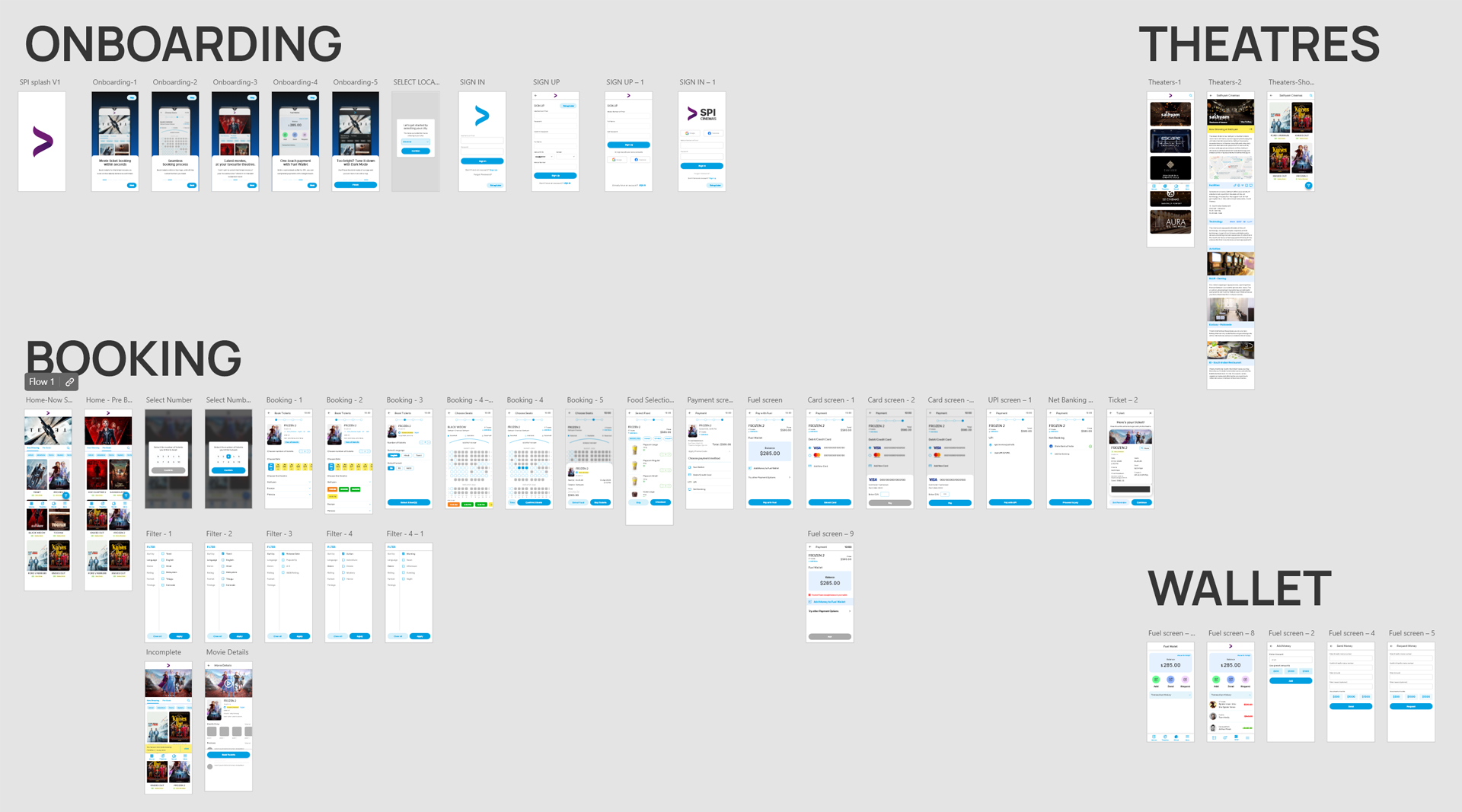
Wireframes
After creating a redefined user flow, I went back to drawing out the screens with pen and paper. I wanted to test out different iterations to see which one would work best in the flow and how I can create the simplest experience for the user.

Once that was completed, I started creating lo-fi wireframes in Adobe XD. I began with copying the screens that I drew and then moved on to adding components and buttons. I had to update a few screens as well as I found out that I had to tweak a few things so that they would look better and provide a better experience to the user.I then created high-fidelity mockups of the design in Adobe XD. I made sure that all the screens had the same color palette and text hierarchy so that the user will have a consistent experience throughout the app. I also made sure that the buttons were placed in the right locations and that they are easy to use for the user.


The new design
I decided to go with the bottom nav bar as it is recommended by Google's Material Design. Because of that, I was also able to split the app into four parts without making it cluttered.
Onboarding
A new onboarding process was crucial to get new users up to speed with the application. I made five screens that showcased the main features of the applications and placed a simple navigation indicator. The user also has the option to skip it.

Movies Screen
I found out that it was hard for users to find the movies they wanted to book tickets for as they had to rely on searching for the movie by looking at the posters. Therefore I decided to insert a search button so that users can reach their favorite movies faster. I also made the text bigger and added some white space to accommodate the text, rating and genres.
I created a new FAB for filters including language, genre, rating, format and showtime. This allowed users to curate the feed to the only movies they are interested in.

Theaters Screen
Some of the users prefer to go to their favourite theater, instead of going to a different one each time. Those users could simply go to the Theatres screen and book for the movies that were playing there.

Booking Screens

The first thing that I did was break down the booking process into 4 steps and I also created a progress bar to show the users where they were in the process. I decided to provide an option to add more ticket once they got into the booking screen so that they don't have to start over. I moved the timer from the top-center to top-left as well.
One of the main problems that users found while booking was that they were unable to see the seats so they could choose them. I do not have any contact with the developers but I assumed it would be cleared up by simplifying that screen. I also provided some cues to find out whether the screens were available, reserved or selected by the users, which were not there previously.
But the most significant change was that I flipped the seat layout and showed where the screen will be. This would help users understand where their seats would be once they get to the theater.
The payment section was simplified and included the things that users chose the most. I decided to give Fuel Wallet, the in-app wallet first place on the screen so that users start using it, which is profitable to the company. I also provided a choice to add a payment method if they have not added it yet.
In the final ticket screen, users can save the ticket to the gallery, which will make it easier for them to find and rush to the theater as soon as possible.
The Fuel Wallet
The Fuel wallet is the official wallet in the SPI Cinemas app which can be used to pay for tickets without leaving the app. Users can add money to the wallet, send it to a friend or request from someone else. I redesigned this screen to show the wallet balance prominently to the user.

Settings & More
The Eat & Go option is for the users who buy food in-app. They can simply scan the QR Code and takeaway theirfood by avoiding a queue.
I added the Account, Payment and Preferences settings into the Settings screen, as the user would normally expect.
The user can retrieve a booking or browse their booking history. In the current app, there were two different tabs named Today and History which were redundant. I combined them and showed the booking history sorted by date.

Prototype
After gathering all the insights from my surveys, questionnaires and design iterations, I created an interactive prototype and started testing it with users. During this, I made numerous amendments to craft a seamless and intuitive interface.
Click on the image to view the prototype.
Conclusion
This was my first ever product design case study so I was confused several times. I was disappointed that I could not interview users and get their insight because of the pandemic, but I decided to improve the experience of using the app for myself and here I am. Thank you for reading this far, I hope you enjoyed it.