
Workflo Dashboard UI Design
Introduction
Workflo is a new task management tool focused on customer engagement and collaborative onboarding. It is specifically built for SaaS companies and their customers. The founders contacted me to design a dashboard for an initial product demo. I created a prototype for two different kinds of users: the customer and the SaaS company administrator.
Tools Used
Figma, Adobe Illustrator, Adobe Photoshop

Before we start…
When the founders approached me at the start of this project, they had a few sketches of how they wanted it to look. These sketches were made in consultation with a UX designer. My duty was to refine the sketches and create a functioning prototype, ensuring it looked pixel-perfect.

Mid-fi Wireframes
When I received the initial sketches for the Workflo dashboard, I was excited to dive right into creating the wireframes in Figma. As a designer, I find wireframing to be an incredibly important step in the design process because it allows me to create a solid foundation for the final designs.
The wireframes are essentially a blueprint for the design, and they help me to create a skeleton structure of the dashboard. It's also a way for me to experiment with different layouts and user flows before moving onto the final design.As part of the design brief, I was informed that I needed to use the same colors as the logomark for the dashboard design. This presented an interesting challenge for me, as I needed to ensure that the colors worked well together and complemented the overall design.
So, I spent some time playing around with the colors in Figma, experimenting with different combinations until I found a palette that worked well with the overall design of the dashboard. By the end of the wireframing stage, I had a solid foundation to work with and was ready to move onto the next stage of the design process.
Overall, I found the wireframing stage to be an important step in the design process, as it allowed me to create a skeleton structure of the dashboard and experiment with different layouts and user flows. It was also an opportunity for me to play around with the colors of the logomark and create a palette that worked well with the design.
Style Guide
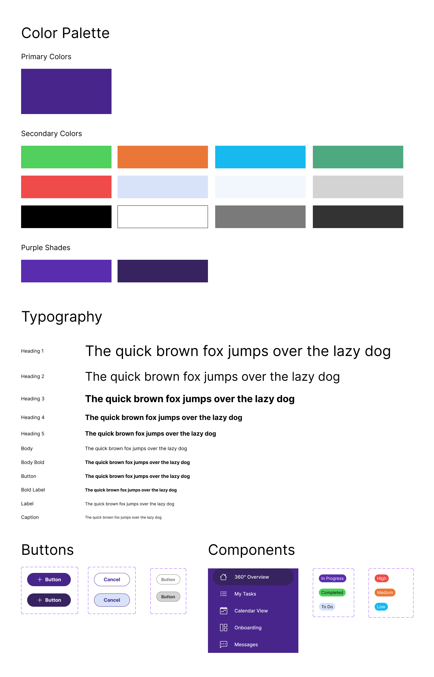
Design Concepts
It was imperative to create a strong foundation to build the polished final design, so I started with the basic style guide with fonts, colors and the structural components that we would use in most pages, like buttons, chips and menus.
Final Design
01
Final Design
It was imperative to create a strong foundation to build the polished final design, so I started with the basic style guide with fonts, colors and the structural components that we would use in most pages, like buttons, chips and menus.
02
Customer workflow
The menus provide a seamless way for the customer to see the tasks that have been assigned to them sorted to their liking. The 360 Overview page shows them the companies they are managing and the Calendar view provides a clear snapshot of their current tasks. They can also contact customers through the built-in messaging screens as well.
03
Administrator workflow
Admins at the SaaS company can see the companies they currently operate with, create new ones and view and add contacts through a seamless process.
Takeaways

I found this project to be refreshing and thoroughly enjoyed working on it. I challenged myself to create a powerful and dynamic dashboard UI, and was able to translate the client's ideas onto the screen almost exactly as they wanted. We went through several iterations to improve the user experience, and are currently in the testing process to further refine the design to best meet customer needs.
You can view the final prototype
here.